This project presents an interactive data exploration dashboard built using R Shiny to analyze patterns in the Netflix titles dataset. The application enables users to dynamically investigate how Netflix content varies across release years, genres, and duration, transforming a static dataset into an exploratory analytical tool. The purpose is not prediction but insight — helping users understand how streaming platform content evolves over time and across categories .
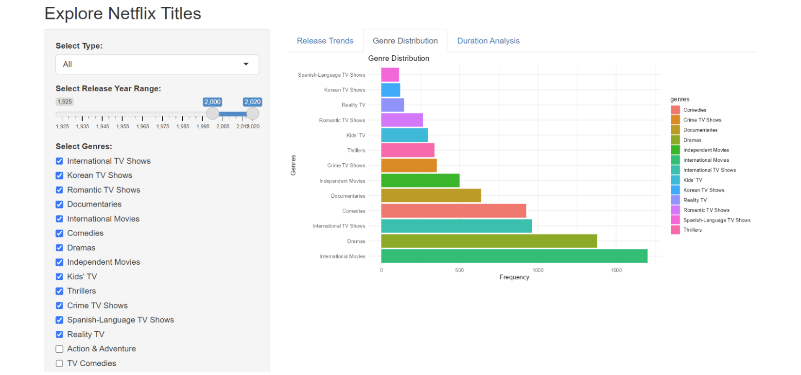
The dashboard provides three main visual analyses. The Release Trends view displays how many titles were released each year, separated by movies and TV shows, revealing temporal growth patterns in streaming content. The Genre Distribution visualization shows the frequency of different genres, allowing identification of dominant and niche categories. The Duration Analysis histogram illustrates runtime distribution, helping users understand typical content length on the platform .
To support interactive exploration, the application includes filtering controls. Users can select content type (movie or series), restrict release year ranges, choose specific genres, and filter by runtime length. These inputs allow customized queries so viewers can examine particular segments of the dataset instead of relying on a single global summary .
The application is designed for portability and reproducibility: the dataset is loaded through a relative path, avoiding system-specific configuration and ensuring the dashboard can run on any machine with RStudio and required libraries installed .
Overall, the project demonstrates how interactive visualization tools can transform raw entertainment data into interpretable trends, providing a practical example of exploratory data analysis using web-based statistical dashboards.